Clear Space01
XX
Maintain a minimum clear space equal to the height of the C² character on every side.
Corporate Identity · 2025
C² DESIGN의 아이덴티티는 공간을 측정하고 완성하는 과정에서 출발합니다. 정확한 설계와 섬세한 시공, 그리고 브랜드와의 긴밀한 협업을 하나의 상징에 담았습니다.
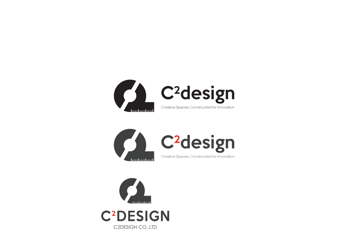
01 · Making
A tape measure becomes
a symbol of partnership.
줄자를 모티브로 한 심벌은 인테리어 설계와 시공의 본질인 정밀함을 의미합니다. 서로 마주 보는 두 개의 C와 중심의 2는 안정적인 균형과 협업을 표현하며, C²는 브랜드와 공간이 만나 더 큰 경험으로 확장되는 관계를 상징합니다.
02 · Precision Rules
Maintain a minimum clear space equal to the height of the C² character on every side.
PRINT · 28 mmDIGITAL · 160 pxBelow the minimum size, use the symbol alone to protect legibility and visual recognition.
03 · Our Color
절제된 모노톤은 전문성과 신뢰를, 선명한 레드는 창의적인 에너지와 실행력을 나타냅니다. 밝은 회색은 어두운 공간에서도 높은 시인성을 유지하며, 레드는 C²와 핵심 포인트에만 사용합니다.
04 · History
From a specialist retail interior studio to an integrated design-and-build partner for leading fashion brands.
C² DESIGN was founded in Seoul as a specialist studio for fashion retail interiors.
Design, technical drawing and construction management were integrated into one delivery system.
The project network expanded across department stores, duty-free stores, road shops and pop-ups nationwide.
Partnerships grew across luxury, contemporary, sports and lifestyle brands with increasingly complex retail environments.
Dedicated millwork, metalwork and vendor coordination strengthened quality control from prototype to opening.
C² DESIGN continues to advance its cross-border readiness, digital workflow and end-to-end project capability.
05 · Logo System
Primary · Dark BackgroundSecondary · Light Background06 · Incorrect Use